PLACE: Oslo, Norway AREA: n/a YEAR: 2022 CLIENT: International Union of Architects and Rehabilitation International TYPE: Graphic design STATUS: Open international competition, proposal TEAM: Audun Hellemo/Kristin Jahr Hilde
RATING
SCALE (small>large)
STATUS (idea>built)
COMMERCIAL ($>$$$)
To make it easier to live a so-called normal life, whether it is in the physical or in the virtual world, accessibility is often a question of both knowledge and attention. When giving attention to all people, regardless of special requirements and needs, a truly accessible society is possible.
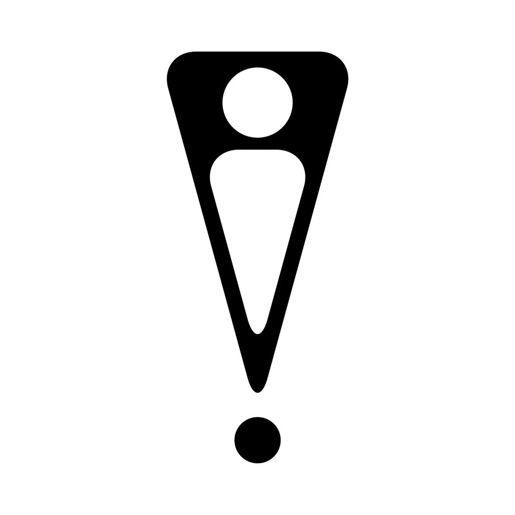
Attention is symbolized with the exclamation mark, already a well-known symbol for being alert and attentive. Inside the exclamation mark is a human figure, abstracted to the absolute minimum: a head and a body, to indicate the purpose of attention. The abstracted figure does not indicate gender, ability, or special requirements but includes everyone. Fitting inside the shape of the exclamation mark, it shows how society should strive to create a robust and flexible framework where everyone can fit, regardless of their starting point.
Design process – from specific to general
The challenge in creating a new symbol for accessibility is evident already in the brief: people with an array of different disabilities – some visible, some invisible – are difficult to categorize and simplify, because the obstacles they encounter and to what degree they represent a hindrance in participating fully in civic life vary as much as with anyone. Thus, the new symbol for accessibility takes the common human experience as a starting point and brings this experience to the center stage.